If you are searching for salon branding ideas, you probably feel the gap between the prices you want to charge and the way your salon currently looks. Clients decide what you are worth before they sit in your chair, from your Instagram grid, your sign, your price list. This guide walks through salon branding the practical way: the idea, the name, the colours, the logo, the wall, the photos, and what it honestly costs in the UK. Written for salon, spa, barber and aesthetics owners who want a brand that justifies premium prices.
TL;DR, salon branding in five moves
- Direction: pick one of the 7 brand directions below and commit to it everywhere
- Name: choose a name that is easy to say, spell and find, then run the UK checks
- Colours: steal one of the three palettes below; use it on everything, forever
- Logo: pick one of the four logo styles; keep it simple enough to read at 2 cm wide
- Proof: shoot one branding photoshoot and build one branded corner in your salon
Not sure your current brand is pulling its weight? Book a free 30-minute strategy call, we will give you an honest read on your branding and tell you what to fix first.
What salon branding actually is (and what it is not)
Salon branding is not a logo. A logo is one piece of it. Your brand is the whole impression a client gets: the name on the door, the colours on the walls, the way your captions sound, the photos on your Instagram, the price list in their hands.
Think of it in five parts, name (what they search for), visuals (logo, colours, fonts, interior), voice (captions, texts, replies), photos (the images carrying the brand online), and experience (what it feels like to walk in).
When all five match, the salon feels expensive. When they do not, a luxury logo next to blurry phone photos and a mismatched price list, clients sense it, and that is what makes them question your prices.
The most common mistake: owners buy a £30 template logo and call the branding done. The logo is the last thing to design, not the first. Direction comes first.
7 salon branding ideas: pick your direction
Before names and colours, pick a direction, every decision after gets checked against it: "does this fit our direction?" Seven directions that work for UK salons:
1. Minimal luxury salon branding. White space, one serif font, black and champagne, the "quiet expensive" look. Suits colour specialists and aesthetics clinics charging premium prices.
2. Botanical calm. Sage greens, clay, cream, natural textures. Suits spas and beauty rooms selling relaxation.
3. Modern bold. Strong colour, confident type, sharp lines. Suits barbershops, city salons and nail studios that want to stand out on a high street.
4. Heritage classic. Deep greens or navy, gold details, traditional lettering. Suits established barbers and salons in period buildings.
5. Playful colour-pop. Blush, peach, bright accents, friendly script type. Suits nail bars, lash studios and younger clienteles.
6. Editorial fashion. Black-and-white photography, stark type, gallery feel. Suits session stylists and creative colourists who live on Instagram.
7. Scandi clean. Pale wood, soft grey, lots of light, simple sans-serif type. Suits blow-dry bars and modern beauty clinics.
Salon names: how to choose one that works
Your salon name does three jobs: it must be easy to say out loud, easy to spell after hearing once, and easy to find on Google and Instagram. Names that fail one of these cost you clients quietly.
Name formulas that work: your name + craft ("Elena’s Hair Studio"), place + craft ("Bath Blow Dry Bar"), a feeling ("The Calm Room"), or a short invented word ("Lumelle").
The 7-point salon name checklist:
- Say it out loud. Does it sound good on the phone?
- Spell it to a friend. Did they get it right first time?
- Google it with your town. Is someone else already using it nearby?
- Check the Instagram handle is free (or close).
- Check the .co.uk domain is free.
- Check Companies House for the company name.
- Search the UK trade marks register, this is the one most owners skip, and it is the one that can force a costly rename later.
Avoid: puns that need explaining, names that lock you into one service ("Nailz4U" when you later add aesthetics), and anything you cannot imagine on a premium price list.
Salon colours: palettes that justify your prices
Colour does heavy lifting in salon branding: clients read your palette before they read a word. Dark and gold says premium, sage and clay says calm, brights say fun and affordable. There is no universally "best" colour, only the right one for your direction and your prices.
A practical rule: 60-30-10. Sixty percent of what clients see is your dominant neutral (walls, backgrounds), thirty percent is your secondary colour (furniture, packaging), ten percent is your accent (logo details, small highlights). One accent, used sparingly, always looks more expensive than five colours fighting each other.
Three ready-made palettes, steal one as your starting point:
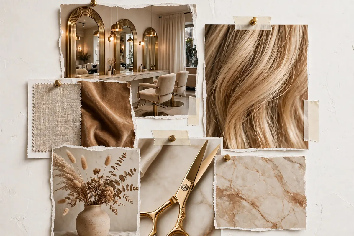
- The Minimal Luxe: ivory, champagne gold, soft taupe, espresso, deep bronze, for premium pricing
- The Botanical: sage, eucalyptus, clay, cream, charcoal, for spas and calm beauty rooms
- The Modern Pop: blush pink, terracotta, warm grey, white, black, for nails, lashes and younger audiences
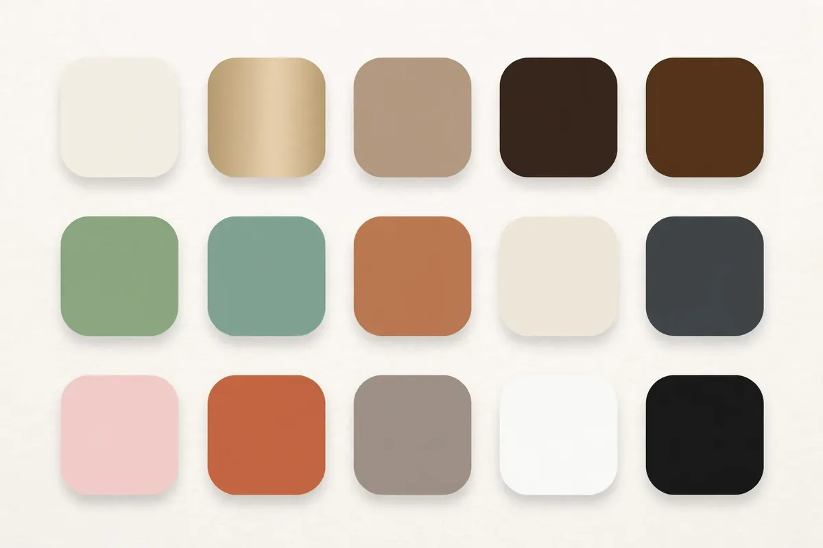
Apply it in order of impact: salon interior first, Instagram grid second, price list and printed materials third. Consistency across those three is what makes a palette feel like a brand instead of a coincidence.
Salon logo examples: four styles that work
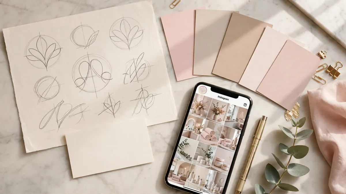
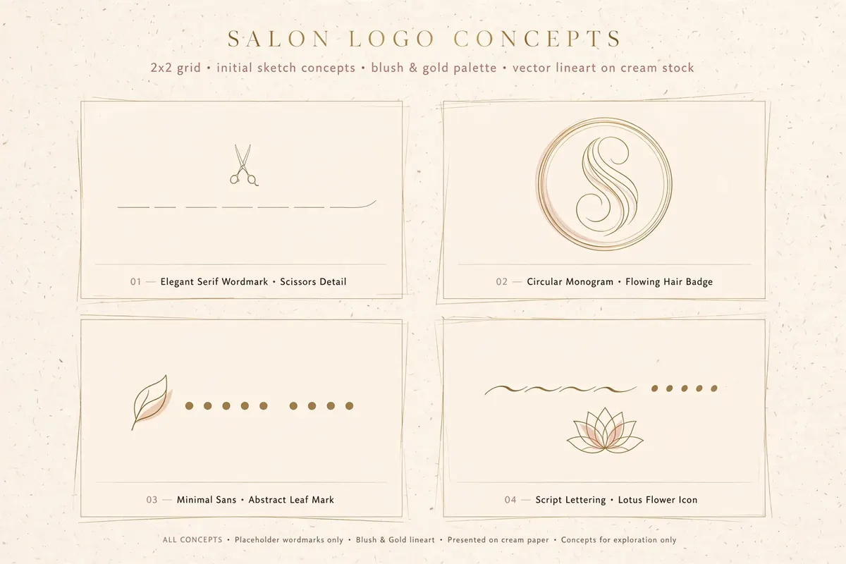
These are original concept sketches made for this article, placeholder wordmarks, not real salons and not client work, showing the four logo styles that suit salons best:
- The serif wordmark, elegant lettering with one small detail. Timeless, premium, readable everywhere.
- The circular monogram, your initial in a badge. Works brilliantly as a social profile picture.
- The minimal sans, clean modern type with one abstract mark. Suits bold, contemporary salons.
- The script + icon, flowing lettering with a botanical mark. Suits beauty, lashes and wellness brands.
The logo rules that matter: it must read at 2 cm wide; you need three versions (full colour, one-colour black, reversed white); always get the vector files (AI/EPS/SVG), not just a JPG. Avoid clip-art scissors, vanishing gradients and more than two fonts. A designer who cannot supply vectors and the three versions is selling you a picture, not a logo.
Make your brand physical: the wall, the touchpoints and the photoshoot
Three places to make it physical:
The modern salon branding wall
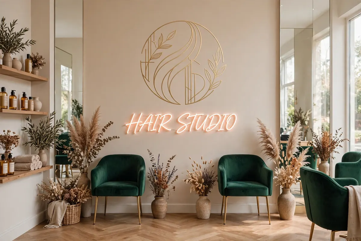
One wall: your logo or a short phrase in brand colours, good lighting, a chair or bench in front. It is the backdrop for client selfies (free advertising with your name in every photo), it anchors your own content, and it tells walk-ins what kind of salon this is within three seconds. Keep it to one statement and light it properly, a beautiful wall in bad lighting photographs badly.
Every touchpoint, one brand
Lay everything a client touches on a table, cards, price list, vouchers, bags, aprons, booking emails. Do they look like they come from the same salon? Most do not.
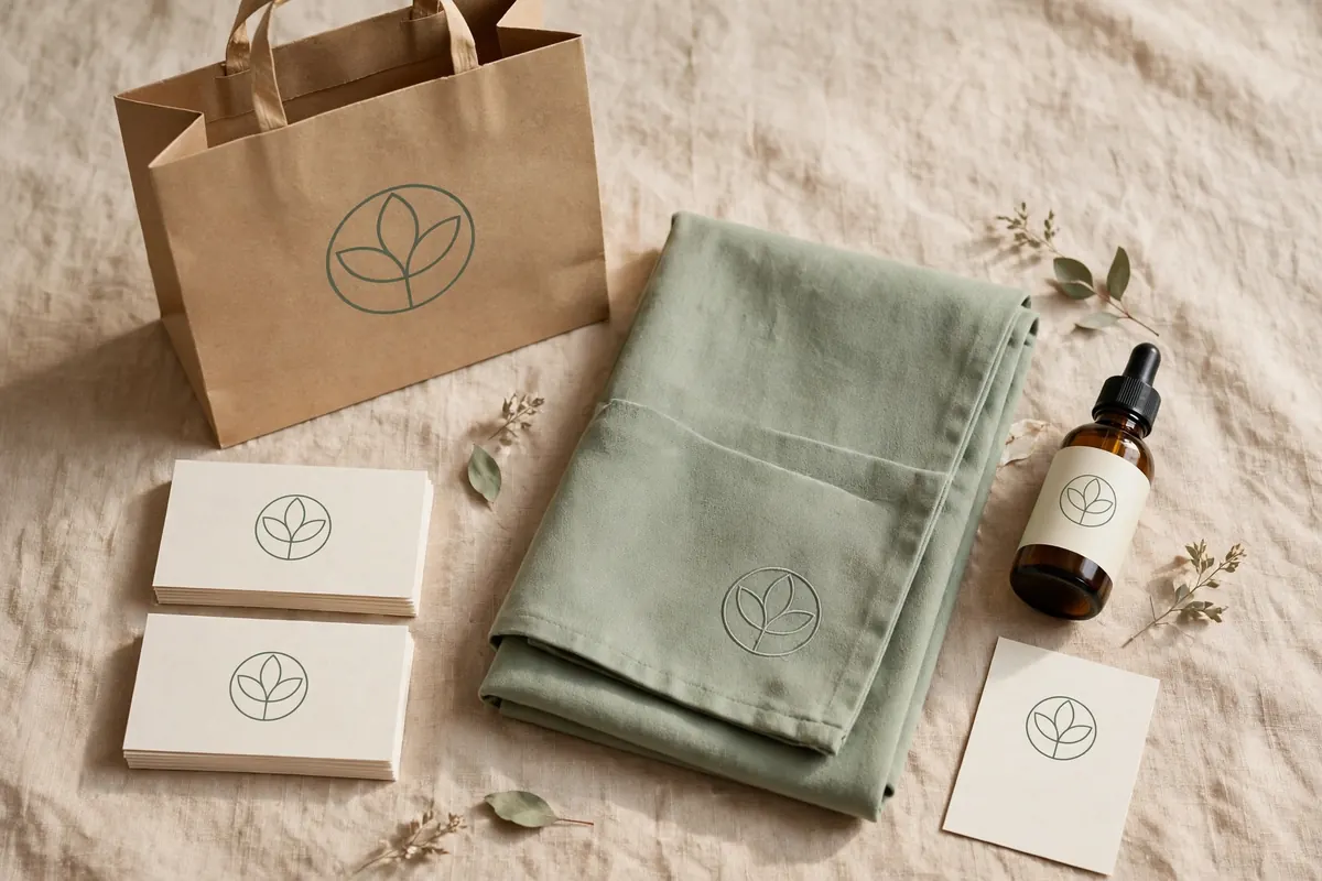
Fix the mismatches in this order: price list (clients stare at it), booking confirmations (every client sees them), Instagram profile (every new client checks it), then printed cards and packaging. On a budget, start with the three clients look at most and work down the list.
Keep your Google Business Profile on-brand too, logo, cover photo, salon photos. Our guide to local SEO for salons covers getting that profile right.
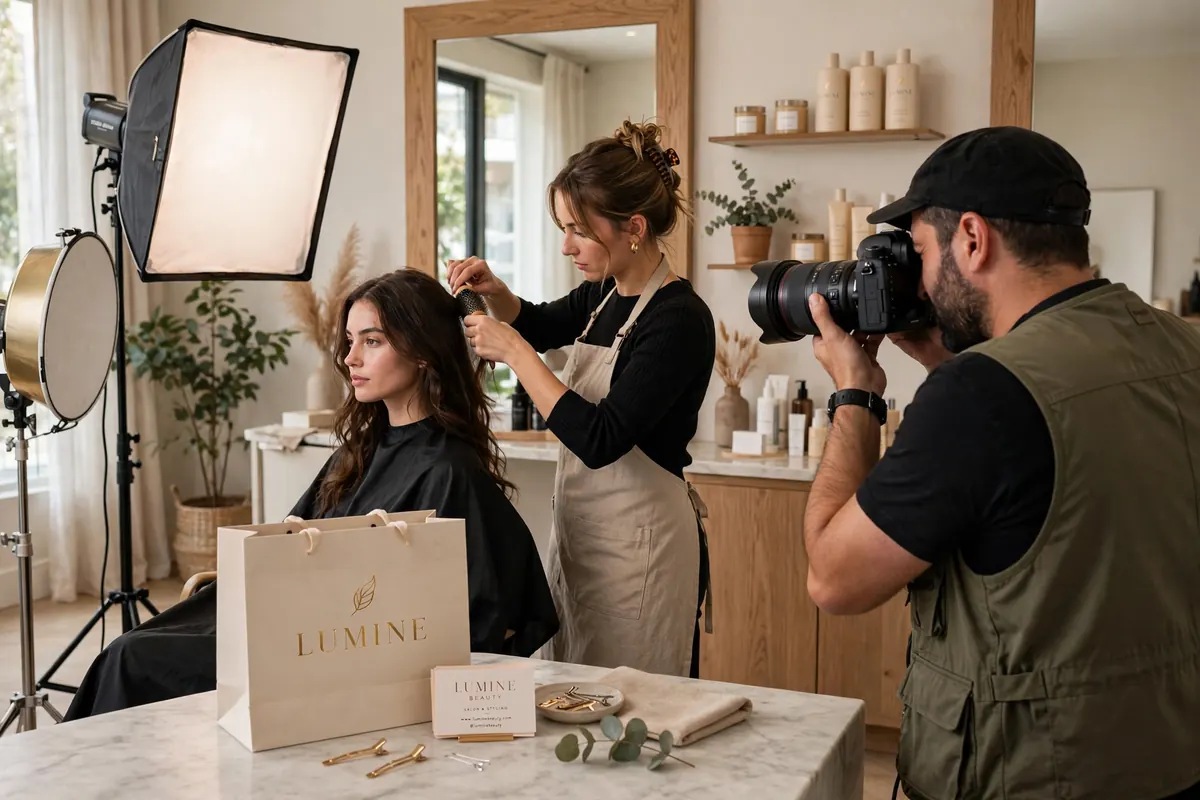
Your salon branding photoshoot: the shot list
One afternoon, a tidy salon, good daylight and a phone on portrait mode will do, or a local photographer for a half day. Shoot to this list for months of on-brand content:
The 12-shot salon branding shoot list:
- Wide shot of the salon interior, tidy and lit
- Your branding wall, empty
- Close-up of your logo (sign, window or wall)
- Stylist hands at work, cutting, colouring, styling
- Tools flat-lay: scissors, brushes, colour bowls in your palette
- Retail products styled on a shelf
- Fresh towels or robes, folded, in brand colours
- Client chair detail, the experience close-up
- Team portrait, natural, in branded aprons
- Before-and-after of one service (with consent)
- Exterior/shopfront in daylight
- One "atmosphere" shot, coffee, flowers, the waiting area feeling
Take the brand to Instagram
Your Instagram grid is your shop window: one photo edit style on every post, brand colours in Stories and templates, and your logo as the profile picture (the monogram style above is ideal for the small circle). Your grid should look like your salon feels.
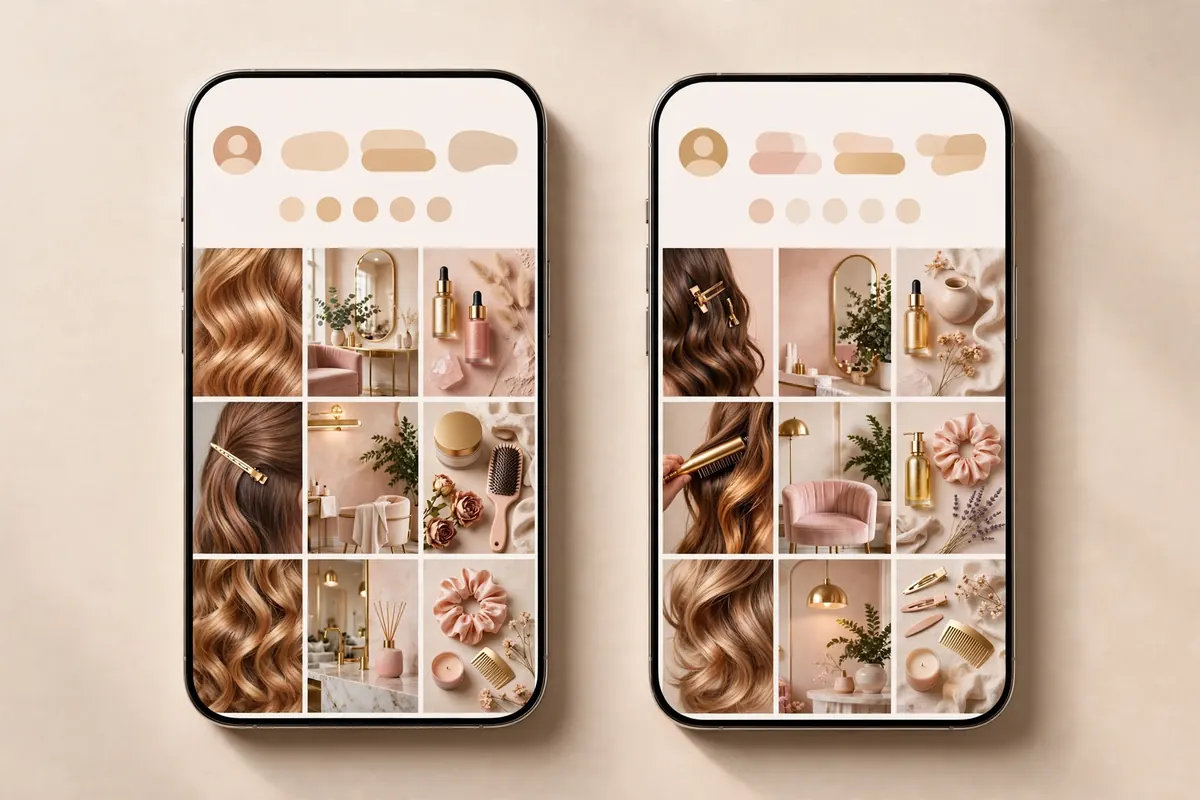
If keeping that grid consistent every week feels like a second job, our social media management for salons exists for exactly that.
📸 Is your branding holding your prices back?
A brand should make your prices feel obvious, not optimistic. Book a free 30-minute strategy call and we will review your name, visuals and Instagram and tell you honestly what is working and what is not.
Free, 30 minutes, no obligation. We reply within one working day.
Your one-page brand sheet (copy this)
Write this on one page and pin it where you will see it, every brand decision gets checked against it:
Our salon brand, one page, Direction (one of the 7): …, In three words we are: … / … / …, Colours: dominant … / secondary … / accent …, Fonts: headings … / body …, We sound: (e.g. warm and direct, never pushy), We never: (e.g. discount publicly, use stock photos of other salons’ work), Our photos always: (e.g. daylight, warm tones, real clients with consent)
Honest costs: what salon branding costs in the UK
Realistic UK ranges for salon branding design:
| Route | What you get | Typical UK cost | Best for |
|---|---|---|---|
| DIY (Canva etc.) | Logo, palette, templates you make yourself | £0 to £150 | Tight budgets; you have an eye for design |
| Freelance designer | Professional logo + basic palette and fonts | £200 to £800 | Most independent salons |
| Brand studio | Full identity: strategy, logo suite, guidelines, templates | £1,500 to £5,000+ | New openings, rebrands, premium positioning |
| Add-ons | Signage, printed materials, website applying the brand | £300 to £3,000+ | After the identity is done |
The decision framework: under £200, go DIY but spend on the photoshoot, not the logo, great photos with a simple wordmark beat a fancy logo with bad photos. One established salon: a freelance logo suite is the sweet spot. Opening new or going premium: pay for the full identity. Refreshing: keep a known name, update the visuals, renaming throws away years of recognition.
A word of honesty: a new logo will not fill empty chairs on its own. Branding makes your marketing believable and your prices defensible, it multiplies what you already do, it does not replace it. If your diary is empty, fix being found first (Google profile, reviews), then make what they find look premium.
Prefer it done properly? Our brand design for salons covers identity, and web design applies it to a site built to take bookings.
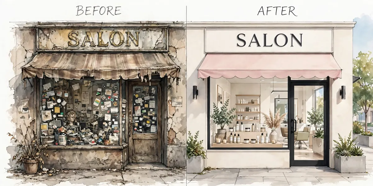
5 branding mistakes that make a salon look cheap
- The clip-art logo. Crossed scissors in a gradient circle tells clients the brand cost £12. Simple type with one considered mark always looks more expensive.
- Five fonts on one price list. Pick two, one for headings, one for body, and use them everywhere. Every extra font makes you look less established.
- No prices anywhere. Hiding prices does not look premium; it looks evasive. Premium salons show prices confidently.
- An Instagram that contradicts the salon. A luxury interior with a grid of blurry, unedited photos breaks the spell. Your grid should look like your salon feels.
- Copying the salon down the road. It makes you the cheaper-looking second version, and clients can tell. Take the direction, not the design.
Frequently asked questions
How much does salon branding cost in the UK?
DIY using free tools costs £0 to £150. A freelance designer typically charges £200 to £800 for a logo with colours and fonts. A full studio identity, strategy, logo suite, guidelines and templates, runs £1,500 to £5,000+, with signage, print and website extra. Start with what your budget allows; great photos matter more than a fancy logo. (51 words)
What makes a good salon name?
One that is easy to say on the phone, easy to spell after hearing once, and easy to find on Google and Instagram. Run the UK checks most owners skip: Companies House, the UK trade marks register, the .co.uk domain and the Instagram handle. Avoid puns that need explaining and names that lock you into one service. (57 words)
What colours are best for a salon?
There is no single best colour, only the right palette for your direction and prices. Dark tones with gold read premium, sage and clay read calm, brights read fun and affordable. Use the 60-30-10 rule across your interior, Instagram and price list. One accent used sparingly always looks more expensive. (50 words)
Do I need a professional logo for my salon?
Not on day one, a clean wordmark in a good font with consistent colours beats cheap clip-art. But once you are established or going premium, a professional logo suite (full colour, one-colour and reversed versions, plus vector files) is worth the £200 to £800 a freelancer charges. It must read clearly at 2 cm wide. (53 words)
How do I brand my salon on Instagram?
Use one photo edit style on every post, your brand colours in Stories and templates, and your logo as your profile picture. Your grid should look like your salon feels. Shoot one branding photoshoot from the 12-shot list in this guide for months of on-brand content. (46 words)
The bottom line
Salon branding is a series of small, consistent decisions: one direction, one name that passes the checks, one palette used everywhere, one simple logo, one branded wall, one photoshoot. None is expensive on its own. Together, they are what makes a £45 cut feel like a £45 cut instead of a £25 one.
Start with the mood board and the one-page brand sheet this week. If you want an honest outside read on where your brand stands, and what to fix first, book a free 30-minute strategy call.
Free, 30 minutes, no obligation. We reply within one working day.
Last updated: October 2026